My Blog List
-
-
The Memory Project 201311 years ago
-
Fall 201312 years ago
-
Walt Disney Family Museum13 years ago
Friday, December 7, 2012
Wednesday, October 10, 2012
Trading Cards
This is a variety of my artist trading cards
I used the art elements : Line, Texture, color, and shape/form
I used the principles: Figure/ground, contrast, pattern, emphasis, and balance
Logo
This is a logo I designed put on a shirt and on a duffle bag
For this project, I used a variety of different elements: Line, Space, and shape/Form
I also used a variety of principles to make those elements come together: Balance, Emphasis, and Contrast
Zoo
drawing of a baby alligator using graphite and pastel for the background
In this drawing of a baby alligator, I used these principles to tie all my elements together: Figure/Ground, Emphasis, and contrast.
The elements I used were: Color, Space, and texture.
In this drawing of a baby alligator, I used these principles to tie all my elements together: Figure/Ground, Emphasis, and contrast.
The elements I used were: Color, Space, and texture.
Memory Book
Two pages from my memory book talking about my adventures in New York for a Pre-Collage program
In these pieces, I used the following principles: Figure/Ground, Pattern, and Contrast
I also used the following art elements to make my pieces complete: Texture, color, Value, and Space
Tuesday, May 22, 2012
Rendering
This was probably my hardest piece this year, because the amount of detail that went into it. This was a rendering of my grandparents at their wedding. This piece contains countour lines, shading, and movement.
Metamorphosis
I created a metamorphosis from a teddy-bear to a stack of pancakes. This piece was completed using color pencils. This piece contains contour lines around the circles of the bear.
Book Cover
This Piece was to take a song or a book that you like and illustrate it. This piece was created with watercolor. It contains color and depth, created by the the wall separating the two figures.
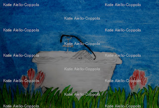
inanimate object
This piece was to take two objects and combine them. I took a microwave and put it in a full bathtub with the cord of the microwave being the hose for the bathtub, which I then placed in a garden. This piece had contrast against the white and black drawing of the bath and the microwave to the bright colors of the garden. This piece also contains color because of the garden and the sky.
altered piece of paper
This was a drawing of a piece of paper that was folded. The picture shows depth through the contrast between the white of the paper and the shadows created by the light. There is also contrast from the table to the paper itself.
Saturday, May 19, 2012
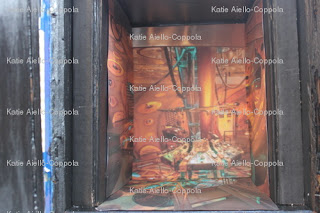
"Chair Project" After
This is the end product of my 3-D box project. I did the three sides in a space theme with acrylic and used a sponge brush and stencils to create the words around the edges. I also used silver sharpie to create the names and the quote on the top of the box. I Used acrylic paint on the door along with transfers for the signs, and nailed in small door knobs. On the inside, I cropped a photo of the inside of the TARDIS and enlarged the, which I then stuck on black cardboard which i attached to the sides back and floor of the inside of the box. This piece was a lot of fun to do, even though it took a long time.
Friday, March 2, 2012
color wheel
This project was taking the colors of the color wheel and putting them in order according to color. I chose to do the colors in snow globes because I like to collect them. This piece was difficult getting all the colors the right shade, especially the red, red-orange, and orange, because the colors are already very similar. In this piece, i used acrylic paint mixed together to create the different colors.
photo book cover
This piece is the cover to my accordion photo book. The photo in the middle is a picture that I took in london during vacation, then I altered the color so it looked antique. Around the outside I used painted the back with white acrylic, and used a pattern stamp with black ink. I like the way that the stamp did not show up in some places, because the black against the white goes nicely against the brown cardboard behind it.
Sunday, February 5, 2012
Best Photos
These photos were taken by me at certain points for my accordion project. The first picture was taken in the city. The next one was taken as a close up shot from my backyard of a succulent after it had rained. The next one was taken from a floor view of stairs at my school looking up. The next picture is of stairs outside my school from a side angle, which I turned to greyscale. The last photo is used for my cover.
Sunday, January 15, 2012
"Chair" Project before shots
This box if for my 3-D end of the year project. I had a box in my garage, and I decided upon a "Doctor Who" theme, which is a british tv show. I had to spray the sides black and spray the front blue, and cut the front wall in half to make doors, which i connected to the sides with hinges and screws.
Subscribe to:
Comments (Atom)


