My Blog List
-
-
The Memory Project 201312 years ago
-
Fall 201312 years ago
-
Walt Disney Family Museum13 years ago
Wednesday, December 14, 2011
Candy Balance Study
This is a drawing of an old fashion Hershey's chocolate bar. The squares beneath it are enlargements of certain parts of the wrapper. It is a contour line drawings, with the silver letters against the brown. There is a lot of negative space around the squares, but that is what makes the pieces work together so well.
Mixed Media Portait
This piece took a lot of hard work to complete. It consist of a structural design, fron the clean cut of the pictures posted on scapbook paper to the structural drawing of my face. There is a lot of texture in this piece, because the raised acrylic paint with the quotes on it, and the transfered picture, and also including the collage element with the different ballet images. I like the movement of the piece, because it makes your eyes travel from the bottom of the piece, to the top, in a very organized fashion.
Tuesday, December 13, 2011
watercolor landscape
This painting is of Linda Mar Beach in Pacifica at sunset. There is some contour lines in the rocks, but as the neutral colors filled it, it became more of gestured lines. The texture is evident by the roughness of the rocks around the edges, and the waves crashing into the rocks represented by gouache paint. I feel like the colors flow very nicely together with the darkness of the rocks and the clouds standing out on the light and muted colors of the orange sunset and the blue ocean.
Still life
This is a still life drawing of my pointe shoe. This is definitely a contour line drawing with the sharpness of the outline with the shoe. The shading in this drawing shows where the shoe has had pressure applied the most. This is a drawing of a 3-D object, drawn from an overhead viewpoint. I feel like the emphasis is on the shading and the details of the piece.
elephant sketch
This drawing is a copied sketch from Rembrandt of an elephant. I added the little hat on the top, because I wanted to express myself a little more through the sketch. This is a contour line drawing with a lot of shading. The texture in this sketch is reflected by the many crosshatching lines, especially in the front of the elephant. These lines are there to show all the creases in the elephant's skin to make it look more realistic.
High contrast portrait
This piece was taken from a picture, which was adjusted, so there was only back and white. This painting has an eve balance of negative and positive space. This piece took a long time, because of the complexity of the hair being combined with the sun. The colors in this piece are very intense, and the emphasis is really focused on wherever it is really dark.
Saturday, October 8, 2011
Freddy Charcoal
 This drawing is of the beginning of the arm and shoulder bone of a skeleton, with only the shadows showing, by the white charcoal pencil.
I feel like this piece was successful, because it really showed the shadows that hit the bone from different angles.
Elements: Line, space
Principles: contrast, emphasis
Gouache Ink Resist
This is a painting of a Manta Ray with a Gouache resist teqnuqie. I used gouache over the whole thing, and covered the bottom half with ink, then washed it off.
This painting consists of a lot of texture, emphasis to the actual Manta Ray, and movement with the small fish swimming around the Manta Ray.
Wednesday, October 5, 2011
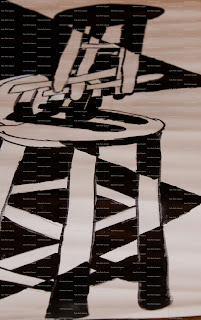
Stool Painting
This painting is of stools stacked up on top of each other,and then
 |
| Add caption |
painted black and white in sections.
I feel like this painting was successful, because of the way that the black is filled into the painting at certain points.
Elements: Shape and form, space
Principles: emphasis, balance
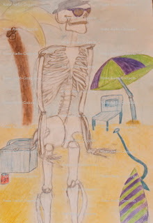
Freddy Fantasy
Subscribe to:
Comments (Atom)


